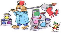
Like a lot of people my age the first memory of anything close to a comic book I remember reading were the Richard Scarry books. While a had great collections of Nursery Rhymes, the Grimm Fairy Tales and Hans Christian Anderson’s works with beautiful imagery, it was the Scarry books that put the fun in fundamental learning. I think it’s from these books that I got a love for finding out how things work. The creative layouts that were more often than not cutaways of buildings, boats or anything where you might find people interacting are to this day still some of my favorite compositions.
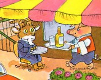
These blurred the line between the educational textbook that would show you a cross section of a volcano and the grid of a comic book. When the layouts weren’t contained in some cutaway it was always this teeming chaos of everyday life. Where there was an economy of line in the drawings there was the polar opposite in composition. Every page in the big Scarry books were crammed with as much character interaction as possible.
Scarry’s life is like that of most artists when you imagine what an artist’s life should be like. He barely attended school opting instead to constantly go to burlesque shows. At some point his father discovered his cache of drawings he made of the strippers. Scarry tried to follow the straight and narrow but his non-existent scholastic achievement kept him from getting into any post-secondary education. He did get accepted to an art college and the Second World War broke.

His time in the army was as successful as his schooling. If it wasn’t for the draft he would have been kicked out since he didn’t really pay attention to the foolish lessons on how he had to walk and talk. When he marked artist as his profession he was assigned to the radio division and was more or less drummed out of it because he refused or couldn’t learn how to fix radios. He was then put on the pamphlet division where he created pamphlets to inspire the troops and remind them what they were fighting for.
Given no guidance on how to accomplish this Scarry basically copy and pasted Time magazine articles together. He met with raging success, got raises and extra time off to travel around the globe. After the war he suddenly had marketable skills and got a job with Vogue magazine. He was fired after 3 weeks because he didn’t fit the position. When he asked why he got hired the manager said she liked his suit.
Eventually he got work with the Little Golden Books and the rest is more or less history. When his big success came in books like Richard Scarry’s Best Word Book Ever and Busy Busy World there were other movements taking hold – feminism and racial equality. Women began to take offense to the gender roles presented in his books and a letter writing campaign began. Scarry was not thrilled by this and argued that since these were an
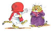 imals in trousers there really wasn’t any gender assigned to most of the characters. It was a weak argument and eventually he went back to some of his more popular books and redid a lot of the art. Busy Busy World was a similar book of its time in that it started as a labour of love incorporating Scarry’s fondness for travel and other cultures but was seen as presenting unflattering stereotypes. It was suggested that characters like Manuel of Mexico (with a pot of refried beans stuck on his head), Ah-Choo the near-sighted panda bear from Hong Kong, and Angus the Scottish bagpiper were no longer acceptable role models for children. Random House quietly subtracted some of Scarry's best stories from future distribution, including the vignette of Patrick Pig, who shouts "UP THE IRISH" after kissing the Blarney stone. There is a comparison of the old and new version of The Best Word Book Ever here.
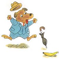
In a lot of ways this was a necessary controversy but it didn’t take away from the basic structure of these books. Instead of a traditional dictionary or word book, Scarry decided to gather words into groups and present them with one large image. Most kids books work from A to Z, whereas the Scarry books are formed on a thematic basis. This is because in a lot of ways the images came first and the words were simply added around them.
Scarry’s artwork is instantly recognizable. That is really the best compliment anyone can give an artist, especially one that was trying to help kids learn. If it’s not memorable then the art hasn’t done its job. This art does its job extremely well for a few reasons I can think of off the top of my head. The first is that Scarry simply hated having empty white space. While this can lead to clutter very quickly it is also one of the major reasons kids love the work. Have you ever tried to draw something with a kid who is at the learning to read age? Try it. I will bet you that the kid tries to fill every last space on the page. How many pictures of families have you seen where the image goes straight to the edges of the sheet? Almost every single one. Scarry’s work does the same thing. Each page is so full of life that it bleeds off the page in just the same way every kid’s drawing doesn’t limit itself to the borders of a sheet of paper.
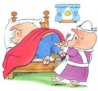
And, not only are the images big, they’re crammed full of activity. Every character is doing something and all the mundane activities in life are presented with a subtle sense of humour and sense of wonder about them. People don’t just change lightbulbs, they have the ladders knocked out from under them and hang from the lightbulb. The images are basically huge and silly, yet the characters are always conscious of their situation without malice. They feel bad when they mess up, but even the characters in mortal danger seem to be rather stoic and understanding about it. After all, it’s just life.

Scarry also had an admiration for the works of Beatrix Potter and took his cue to use anthropomorphic characters from her work. Whereas Potter went for a hyper realism, Scarry went for the more abstract. His characters are simple. They are reduced to their core components with a reserved approach to using line art in much the same way an animator reduces characters to their essence with minimal lines. It allows for more expression and range of emotion, and again having pigs and hippos in mortal danger won’t accidentally traumatize a child if it was a human.
In a lot of ways his art works simply because it shouldn’t. These are huge uncontained images seemingly at random. Inside the images are almost utter chaos yet everyone is respectful and polite. Nobody is threatened because someone has messed up. They are accepting of other characters faults and it is one of the most racially diverse universes ever created. Not bad for a gateway into comic books. If only the adult versions were as knowledgeable of form, content and audience as Scarry’s books are.

1 comment:
"While this can lead to clutter very quickly it is also one of the major reasons kids love the work."
One reason this works is that kids will pick a favorite character, and get the challenge of searching for that character in the busy picture.
Post a Comment